Tonight I would like to show you some before and after pictures for Gold we watched develop in real time. The reason I want to show you these long term chart patterns is so you know how important it is to have the big picture correct. If you have the big picture correct then you can use the shorter time frames to fine tune entry and exit points.
Also when you have the big picture correct you know that when the next important rally phase begins in a bull market it isn't going to be over in a short period of time. This is where many investors, that don't understand the importance of a big chart pattern, will try to trade in and out and will eventually be left behind and there is no worse feeling than being left behind in a very strong impulse move.
We are currently seeing this in the US stock markets right now. Since the October 2023 low last fall the SPX for instance hasn't had a correction of over 3% leaving would be investors on the sidelines waiting for a bigger correction to get positioned. Maybe we will see a 10% correction before the current strong impulse move ends, but if the stock markets are in a true melt up phase those waiting for a low risk entry point will never get what they had wished for and will miss out on one of the greatest bull runs in history.
The toughest part of finding a big trading range that is still under construction is to wait for the pattern to complete. Many times in regards to a big trading range you might have to wait six months to a year or longer waiting patiently for the breakout to occur. Most investors don't have the patience to wait that long and begin to over trade in frustration.
The beautiful part of finding a big trading range well before it completes is that you can be totally prepared for what is to come. Some of the biggest gains can come in the first few months of a strong impulse move as the price action blasts off leaving investors who were wondering, was that the bottom in disbelief, especially after a 4 1/2 year correction. It's always easy to see the bottom in hindsight, but in real time it can be tricky, but if you have been waiting patiently for the setup you can be cool, calm and collected.
This first chart for tonight is the long term quarterly line chart we've been following even well before the breakout of the black expanding triangle. Look at where Gold was trading and what I suggested in the last sentence.
This is what I wrote on February 20th of this year just a few short months ago in regards to the 2020 black expanding triangle on Gold.
February 20, 2024:
With less than six weeks left of trading for the 1st quarter of 2024 Gold has tested the top rail of the black expanding triangle. A bullish sign would be to see no backtest at the end of March, but a new higher high.
Today April 7, 2024:
As you can see Gold did in fact show no backtest when the quarter ended at the end of March and shows a very strong breakout move. The reason I wasn't expecting to see a backtest at the end of March is because from a quarterly line chart perspective they don't show up.
Also when you look at this quarterly line chart very seldom do you see a lower monthly close. The biggest one we saw during the 2000 to the 2011 bull market was the 2008 crash low which is hardly noticeable. The impulse move out of the 2016 H&S consolidation pattern showed some nice reverse symmetry to the upside over the same area on the way down from the 2011 bull market high, blue arrows.
Lets now look at the 2020 trading range for Gold and what took place at the, Flat Top Expanding Triangle low or fourth reversal point. I was explaining its relative size to some of the previous consolidation patterns.
November 27, 2022:
Lets go back even further in time to see how the 2020 flat top expanding triangle looks relative to the other trading ranges before it. In 2008 Gold formed a fairly large H&S consolidation pattern that led to the blow off top in 2011. Gold then formed the blue rectangle that ended up having six reversal points before the price action broke to the downside. Again, the blue rectangle began to form below the 2011 high which is why it needed an even number of reversal points to be a consolidation pattern.
The bear market that followed the 2011 high finally came to an end with the formation of the nearly 6 year H&S consolation pattern. I'm calling it a consolation pattern because it is still forming in the 2000 secular bull market. The minimum price objective was hit, black arrow, with a little more follow through to the upside before that particular impulse move came to an end where the 2020 flat top expanding triangle began to form.
Gold still has a lot of work to do like closing a month above the 10 and 20 month ema's for starters. Using the bottom rail of the 2020 flat top expanding triangle as a line in the sand you can see the risk to reward ratio massively favors the bulls especially if we are witnessing the last reversal point.
Same post: 2nd long term chart for Gold with the possible price objective as shown by the blue arrows
Looking out a little further in time you can see how the 2020 flat top expanding triangle fits into the slightly bigger picture as a possible halfway pattern. Since the 2016 triangle formed above the 2016 low it only needed four reversal points to be a valid consolidation pattern that worked out beautifully. That strong impulse move that began at the 4th reversal point formed several smaller consolidation patterns before the price action finally topped out in August of 2020 where the current flat top expanding triangle began to form. If this is the 4th reversal point the blue flat top expanding triangle will have a price objective up to the 2882 area as shown by the blue arrows.
Today April 7, 2024:
Below is the current weekly chart for Gold and shows what followed after the 4th reversal point low in the 2020 expanding flat top expanding triangle on the chart above.. The black arrows still show the minimum price objective around the 2880 area.
Now lets look at that massive 2016 H&S consolidation pattern that reversed the 2011 bear market and what followed.
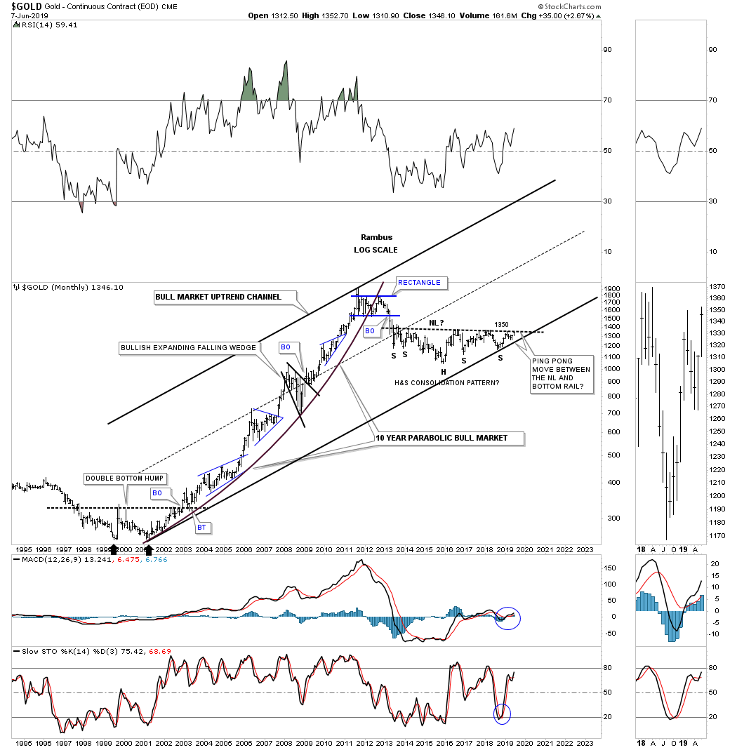
This is what I wrote on June 8, 2019 almost 5 years ago.
It's hard to believe that the massive H&S consolidation pattern we've been following for several years began to develop all the way back in 2013 during the initial crash off the 2011 high. This weekly line chart shows the price action closing this week right on the neckline at 1350. Note how many touches the neckline has experienced from below with each one backing off. Now the question remains, how may bears are left to defend the 2013 neckline? There is a good chance that if they are exhausted that the price action could just spike right through the neckline this time around completing the massive H&S base which would be long term bullish. Big patterns lead to big moves.
Same post longer term view.
This monthly chart shows how the H&S consolidation pattern fits into the bigger picture.
Same post 2000 secular bull market uptrend channel. Note the ping pong move I pointed out between the neckline and the bottom trendline of the 2000 secular bull market uptrend channel.
The reason I call this H&S a consolidation pattern is because of the way it fits into the major secular bull market uptrend channel.
Today April 7, 2024:
You can see that small ping pong move between the H&S neckline right shoulder and the bottom rail of the 2000 secular bull market uptrend channel and what followed.
Back to the present. Below is the weekly candlestick chart for the PM complex we've been following for half of its existence. Since the October 2023 low the price action has built either a H&S consolidation pattern or a double bottom both of which are reversal patterns. Note several of the breakout gaps that occurred last Monday on the breakout of the neckline or double bottom trendline. Since they both have formed just below the top rail of the 2020 bullish expanding falling wedge it is strongly suggesting the top rail is going to give way. As you can see the GLD and SLV have already broken out with the GDXJ and SILJ strongly testing their top trendline.
This next long term monthly chart for the PM complex goes all the way back to the very symmetrical H&S tops that formed at the end of the 2000 bull market. The black dashed 2016 vertical line divides the bear to the new bull market which I know doesn't feel like it because of all the sideways chopping action since the 2016 low.
This combo chart focuses on the 2016 uptrend channel in most cases with the May 2022 triangle forming off the bottom trendline. In some cases the May 2022 triangle top trendline can extend back to the previous high making that trendline even more important which will be the next area of overhead resistance.
We'll finish up by looking at the top rail of the bear market downtrend line taken form the 2011 high connecting several of the lower highs most notably the 2020 high. Please note where SLV, GLD and GDXJ were trading at the end of January of this year.
This is what I wrote on January 26, 2024:
This last chart for tonight is just a simple quarterly line chart. What this chart shows is the top trendline taken from the top in 2011 and the top made in 2020 which is slopping down showing the downtrend line which is still in play since 2011 except for Gold which has the only up slopping trendline. If the PM complex can overcome that 2011- 2020 trendline the bear market will be officially over IMHO. As you can see SLV has been testing it many times, but so far has failed to take it out. Hopefully it is just a matter of time.
The bottom line is that I'm still bullish on the PM complex, but just keeping an open mind if things don't start improving soon. It looks like Silver could be the key to the next important direction for the PM complex. We have several different roadmaps in front of us that should help guide us and give us an important edge in staying on the right side of the PM complex.
Today April 7, 2024:
Now compare what SLV, GLD and GDXJ have done since January of this year. SLV has completed its large H&S consolidation pattern breaking the top rail of the 2011 downtrend line and the neckline in one breakout move. The backtest on GLD's expanding triangle did in fact hold support and now the GDXJ is attempting to breakout above its 2011 downtrend line.
We are finally beginning to see that 2011 bear market downtrend line, which has been in control for 13 years, finally starting to give way. The metals are leading right now, but the PM stocks should begin to play catch up in a way we haven't seen in a long time. Stay tuned as the, everything bubble phase, is still rocking and rolling. Have a great weekend and all the best…Rambus